The Purpose of Customizing Charts:
Customizing charts in Power Apps serves several key purposes:
- Data Visualization: Create visual representations of data to improve data analysis and understanding.
- Data Insight: Customize charts to present data in a way that highlights key insights and trends.
- User Experience: Enhance the user experience by providing interactive and informative data visualizations.
Design charts
Objective
In this comprehensive guide, we will walk you through the process of customizing charts in Power Apps, a key component of the Power Platform. Customizing charts allows you to visually represent and analyze data to meet your organization's unique needs.
Prerequisites
- Access Permissions: Make sure you have the necessary permissions to modify charts within the app. (Minimum 'System Customizer'-Security Role or Admin)
- Data Model Understanding: Familiarize yourself with the data source or entity from which the chart retrieves data.
Click Through
Step 1: Open the Power Platform
- Launch the Power Platform by visiting the page make.powerapps.com
- Choose the specific environment where you want to customize charts. Click on the top-right environment name to enter it.
- Click on Solution in the left navigation.
- Open your storage for customization (see a guide on how to create one here)
- In your chosen Solution, you see all Objectives
- Navigate to Tables and click on the little arrow
- Now choose the specific entity (table) or data source that contains the chart you want to customize. Click on the relevant entity.
- Once in the entity, find and click on the Charts section. This is where you will customize the properties of the chart.
- In the "Charts" section, you will see a list of charts associated with the entity. Choose the chart you want to customize by clicking on its name.
- Click on the "Edit" or "Customize" button to enter the customization mode for the selected chart.
- While in the customization mode, you can modify various chart properties, including chart type, data series, labels, colors, and legends.
- In the chart you can combine several entities, if they have a relationship together. For example you can create a chart where all Departments are shown and how much employees each Department has.
- For this example you would add a chart in the entity Department
- Add Headcount in Legend Entries (Series) and Department in Horizontal (Category) Axis Labels
- If needed, configure interactive features such as drill-through actions or data filtering to enhance the chart's functionality.
- Once you've made the desired modifications, don't forget to save and publish your changes, by clicking on Tables in the left Navigation bar (Objects) and press the Button Publish all customizations
Hint
- You can also create new Charts by clicking + New chart on the top.
- If you want to create later Dashboards, Charts are always needed, so that the Dashboard can show the correct Data.
Result
Your customized chart is now ready for use in your Power App. Customized charts enable better data visualization, analysis, and presentation, and they enhance the user experience.
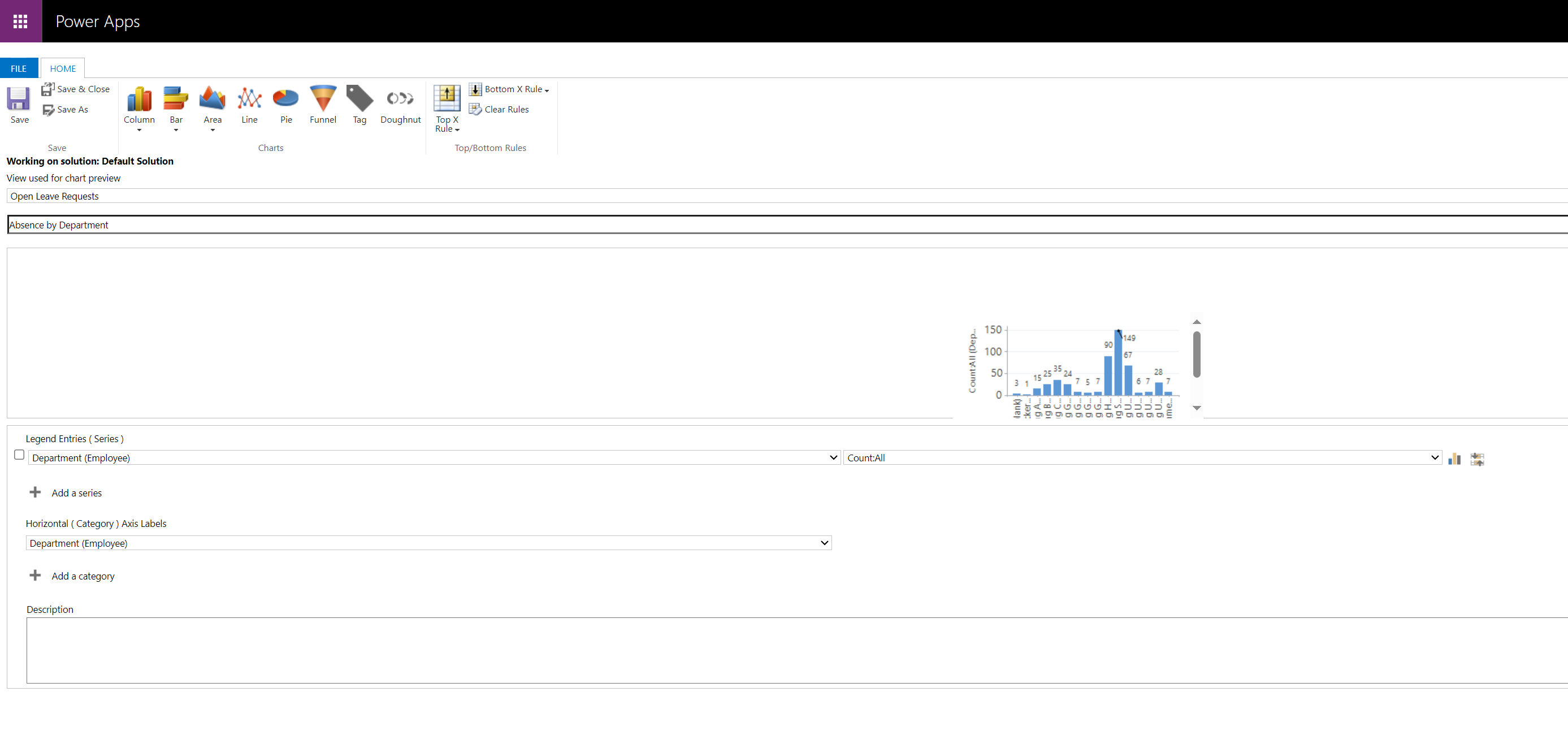
Below, you can see an example for a customized chart.
Below, you can see an example for a customized chart.